



Buckner Retirement Services
One Brand, Built for Every Community to Come
Our Role
- Brand Evolution
- Brand Guidelines
- UX/UI Design
- Web Design & Development
- Print & Collateral
Overview
Buckner Retirement Services runs senior living communities across Texas, part of the nonprofit mission of Buckner International. Each had grown its own palette, its own type, its own website. Put two side by side in a prospect’s browser tabs and they read as two different organizations.
We came on as agency of record in 2025 to run paid media. It didn’t stay there. What began as media turned into a brand evolution, a website platform, and a set of guidelines Buckner’s team could run without us.
One Brand, With Room to Flex
Buckner’s communities split into two tiers. Traditional offers the full continuum of care. Essential is newer, focused on independent living at a more accessible price. Both had to read as Buckner, and a prospect had to sense the difference without anyone spelling it out.
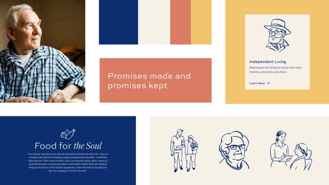
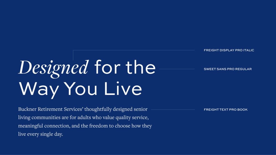
Every tier anchors to the corporate blue palette, with a non-blue accent that shifts by tier. Headings and body share one structure, and Essential gets its own typographic voice inside it.
Buckner kept the logos off the table. That constraint shaped everything else, because color, type, pattern, and iconography had to carry the identity on their own. Most communities don’t have the photography to lean on either, so the pattern and icon set were built to hold a layout by themselves.
A System That Scales to Every Community
Custom sites per community are what fragmented the brand in the first place. So we designed one page design for the corporate site and every community site, built modules first and stacked into pages. Development gets a component library. Each community gets a kit.
Tiers are a setting, not a separate design. Swap the accent color and the type treatment and a page moves from Traditional to Essential with no redesign.
We cut back the navigation and tightened the content. A persona module lets homepage visitors split early between searching for themselves and searching for a loved one. Floor plans collapsed onto one page. Awards came out of the footer. Motion stays deliberate, one idea per viewport.
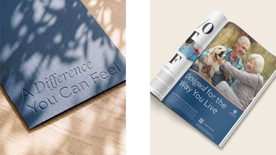
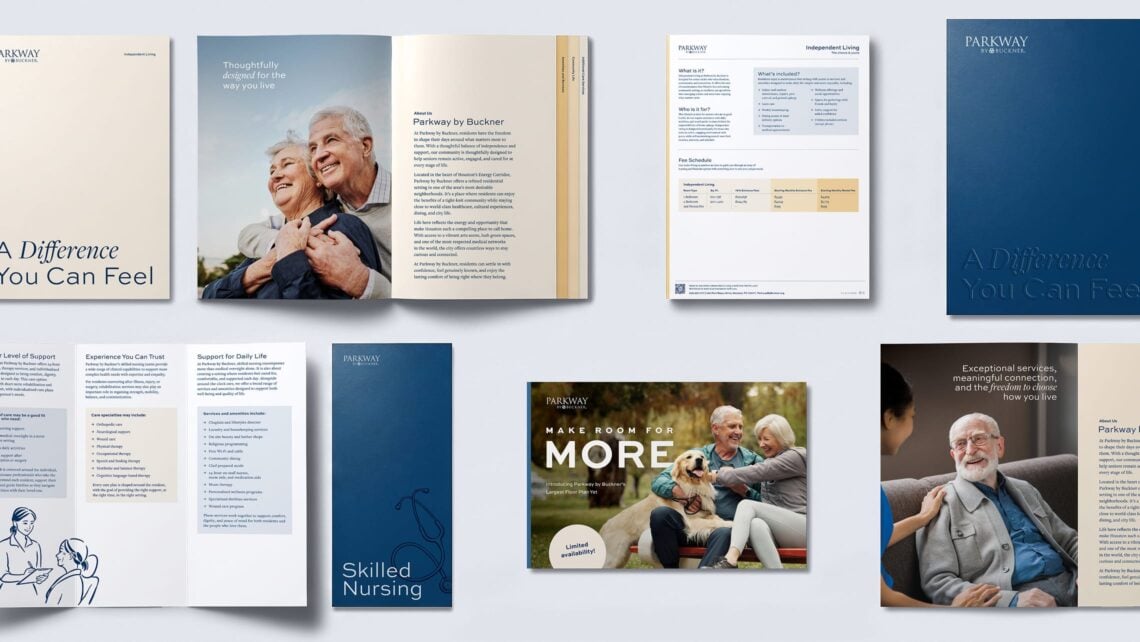
Carrying the Brand Off the Screen
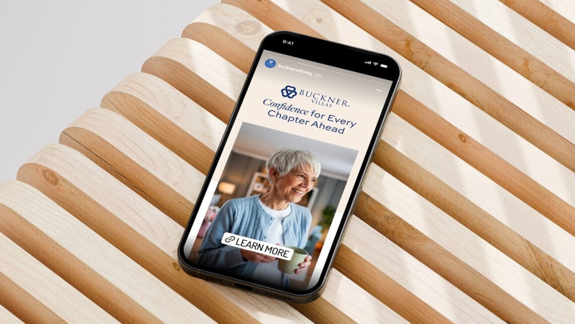
The same design runs through print ads, direct mail, prospect collateral, display, and social. A family sees a mailer, lands on the site, and they’re looking at one brand. It’s all documented in a Buckner-branded guidelines PDF, with plain-language callouts on key pages, because the people reaching for it are marketing directors and sales teams with no reason to know the jargon.
Where It Goes Next
Buckner has one brand now, one platform behind it, and rules a new community can pick up on day one. As the Essential tier expands and new properties come in, they join a system that’s already built for them.
More of our work
All case studies
BODYBAR Pilates
A redesigned website for BODYBAR Pilates, built to welcome new clients, future franchise owners, instructors, and members as the brand grows to 200+ Reformer studios.

Safe Harbor Conference
An inside look at the launch of Safe Harbor 3.0, unveiled at the company's leadership conference through a custom-designed brand experience.