December 15, 2023 BY Katie Darden in Articles
3 Brands Who Got Their Refresh Right

Successful brand redesigns are our Roman Empire around the office. Rebranding is an incredible tool to help companies refresh and evolve. A new look can certainly turn heads and create new buzz. While creating the initial double-take can be fun and new, it’s crucial to think about how a branding refresh can create success (or be a detriment) in the long term. With it requiring both time and financial investments, brands need to approach the change strategically to maximize their efforts.
Whether you’re thinking about a full transformation, or a small refresh to stay ahead of design trends, there are some brands in recent years who we think offer great inspiration.
1. Burger King

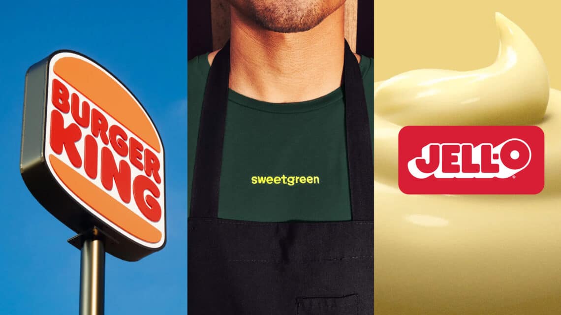
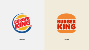
Burger King took their own advice and decided to have their brand, their way. The 2021 rebrand incorporated a touch of nostalgia with some modern flare. Wanting to display freshness and craveability, Burger King introduced a warm color palette that replaced their previous synthetic feeling yellow and blue. And if the new logo looks familiar to you, you’re right. The burger franchise pulled elements from their logos from 1969 to 1999 to make what we see today.
2. Sweetgreen

We all know the importance of eating healthy–getting our greens, having enough protein. But oftentimes, healthy food is tied to the assumption of being boring and bland. That’s until Sweetgreens entered the chat. In 2021, the fast casual restaurant underwent a brand refresh to help consumers be excited about healthy food. Taking inspiration from hand-painted vintage cookbooks, they created a brand aesthetic built on vibrant colors, quirky illustrations, and close-up food photography. You’ll find images of juicy chicken, crisp lettuce, and plenty of fresh vegetables–anything but boring or bland. Are you drooling yet?
3. JELL-O

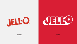
This year, JELL-O underwent a significant refresh after having the same packaging design for over a decade. They modernized the 125 year old brand by adding a 3D effect to their font, shifting from realistic fruit imagery to jelly fruit illustrations, and simplifying the packaging. The aesthetic transformation introduced a playful and fun nature, letting you know it’s more than just your grandma’s favorite snack.
What do all of these brands have in common? The past. While Burger King and Sweetgreen pulled inspiration from previous decades to shape their current design, JELL-O sought to leave its deep rooted perception in the past to continue evolving with the generations. One thing’s for sure: Nostalgia can be a powerful tool for brands to reinvigorate their target audience and increase their exposure to other demographics.
Successful rebrands demonstrate the power of visual design in shaping a brand’s identity and perception. With each new look, they have the opportunity to refocus a customer’s attention on their values and mission, transforming the whole experience.
If you’re thinking your brand’s identity could use a fresh coat of paint, you’ve come to the right place. At Tegan, we take pride in strategically guiding our clients on a visual redesign that aligns with who they are and where they want to go. We’d love to do that for you.


