


Neptune's Frozen Treats
Modern Myth-Making With a Twist
Our Role
- Branding
- Messaging
- Packaging
- Web Design
- Social Media
Overview
Neptune’s Frozen Treats is a new premium dessert shop opening its first location in the idyllic coastal city of Palos Verdes Estates. Set in the iconic Malaga Cove Plaza, Neptune’s was created with a clear vision: to serve high-quality, customizable frozen treats in a setting that feels elevated while remaining warm, welcoming, and distinctly fun.
To bring that vision to life, the team behind Neptune’s needed a fully realized brand that could connect with families, appeal to health-conscious consumers, and carve out a strong identity in an upscale market.
That’s where Tegan came in.
Overview
We partnered with Neptune’s from the ground up, guiding strategy and execution across three key categories: messaging, branding, and point-of-sale (POS) assets. Our goal was to help define the personality, story, and visual language of the brand while ensuring every detail — from tone of voice to in-store signage — felt intentional, cohesive, and community-first.


Bringing the Sea God to Life
Before any visuals or campaigns could take shape, Neptune’s needed a messaging framework that could define who they are and how they communicate, both internally and with the public. Tegan developed a complete messaging framework that would anchor the brand’s identity and serve as a guide for all future marketing efforts.
We began by establishing the tone and personality. Neptune, the Roman god of the sea, became the voice of the brand: wise, witty, and charismatic — not a distant deity, but a familiar, approachable figure with a soft spot for flavor combinations and a passion for building community connections. (Think retired humanities professor meets fun uncle.)
From there, we built a messaging suite that included:
• A flagship brand narrative grounded in the setting and spirit of Malaga Cove Plaza
• A brand positioning and tone guide to steer brand voice
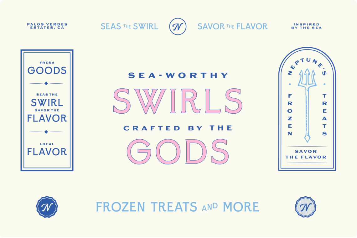
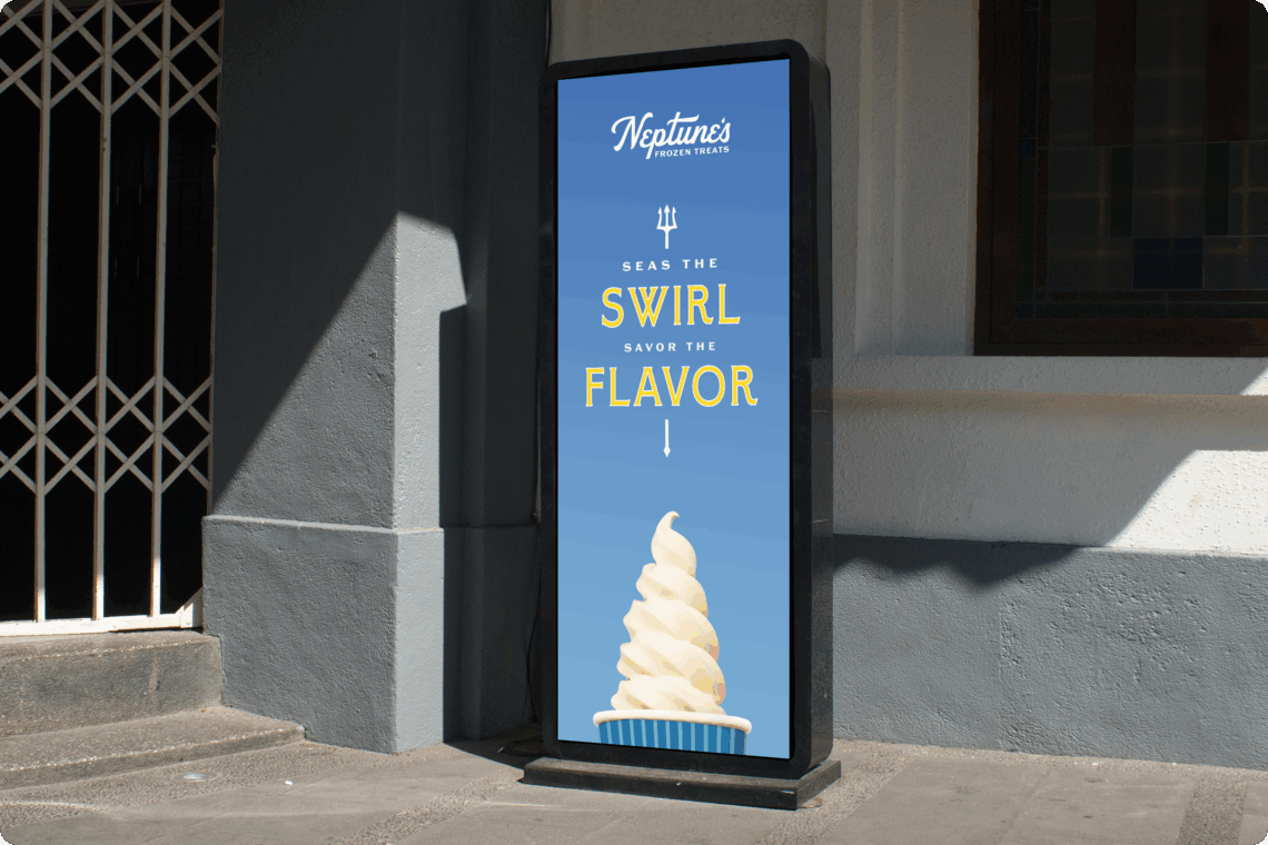
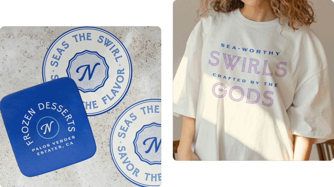
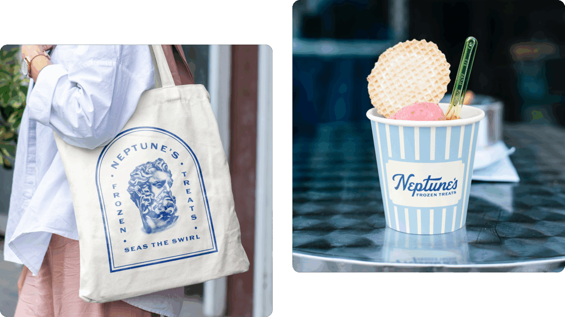
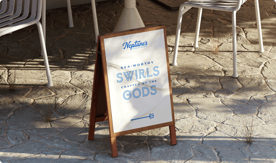
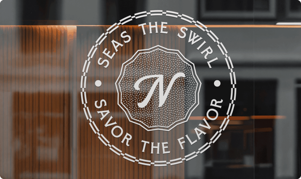
• A flexible, standout tagline: “Seas the Swirl. Savor the Flavor.”
• A fully imagined brand persona that gave Neptune a unique point of view an made the voice instantly recognizable
A Modern Take on the Classics
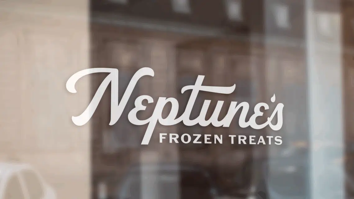
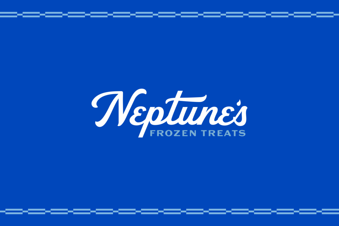
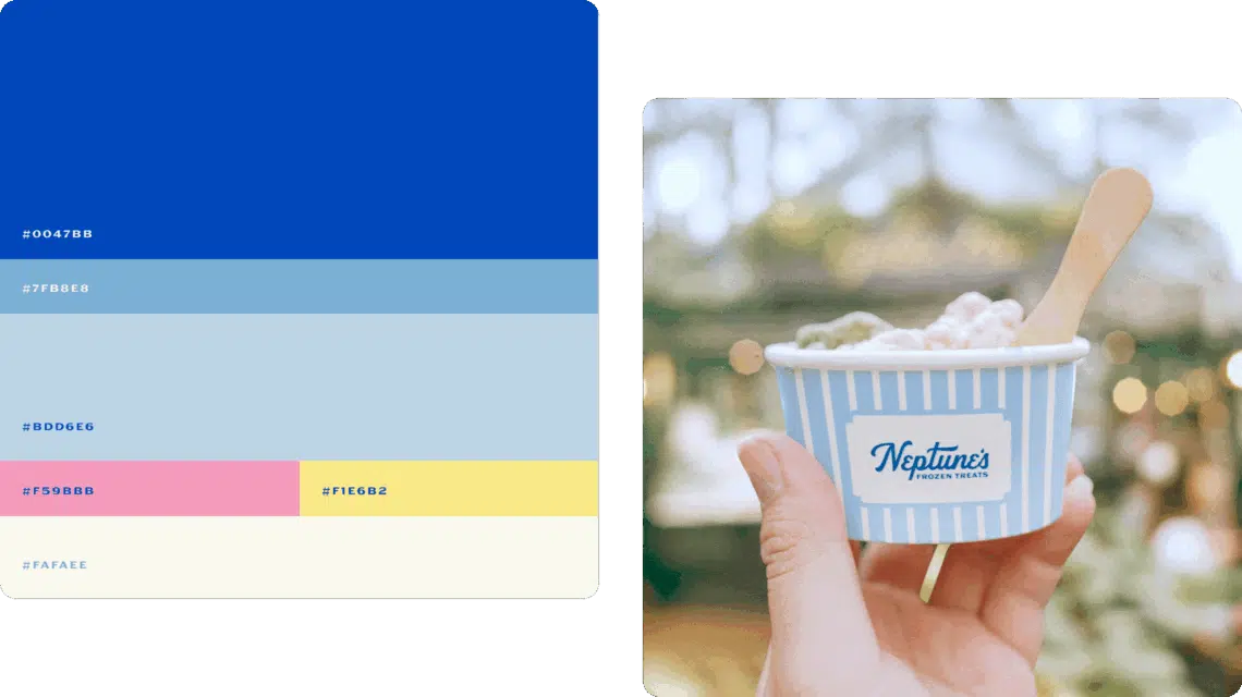
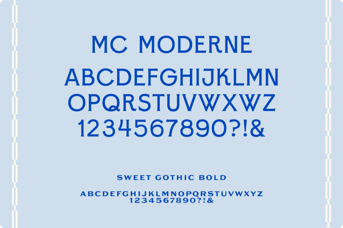
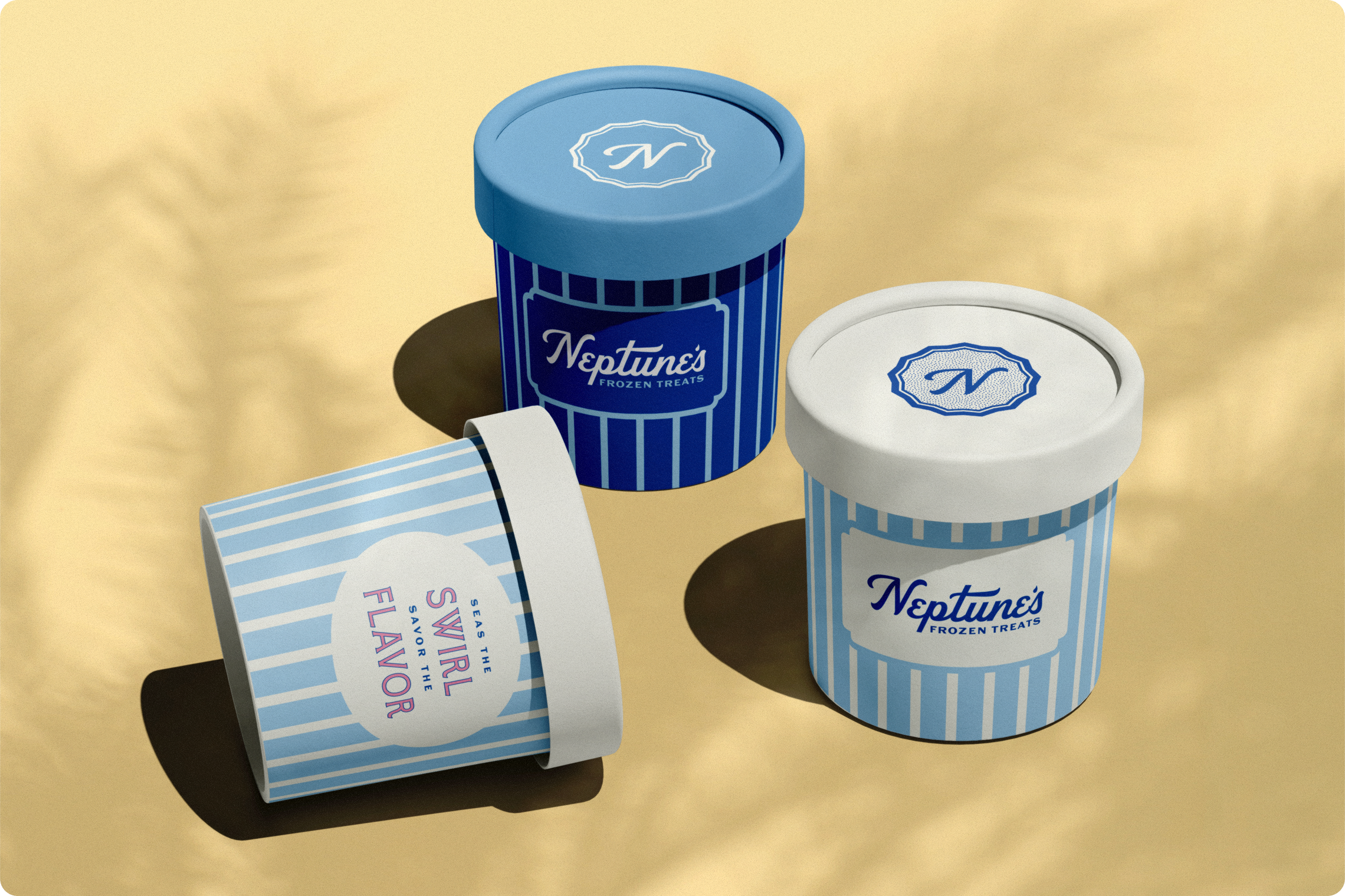
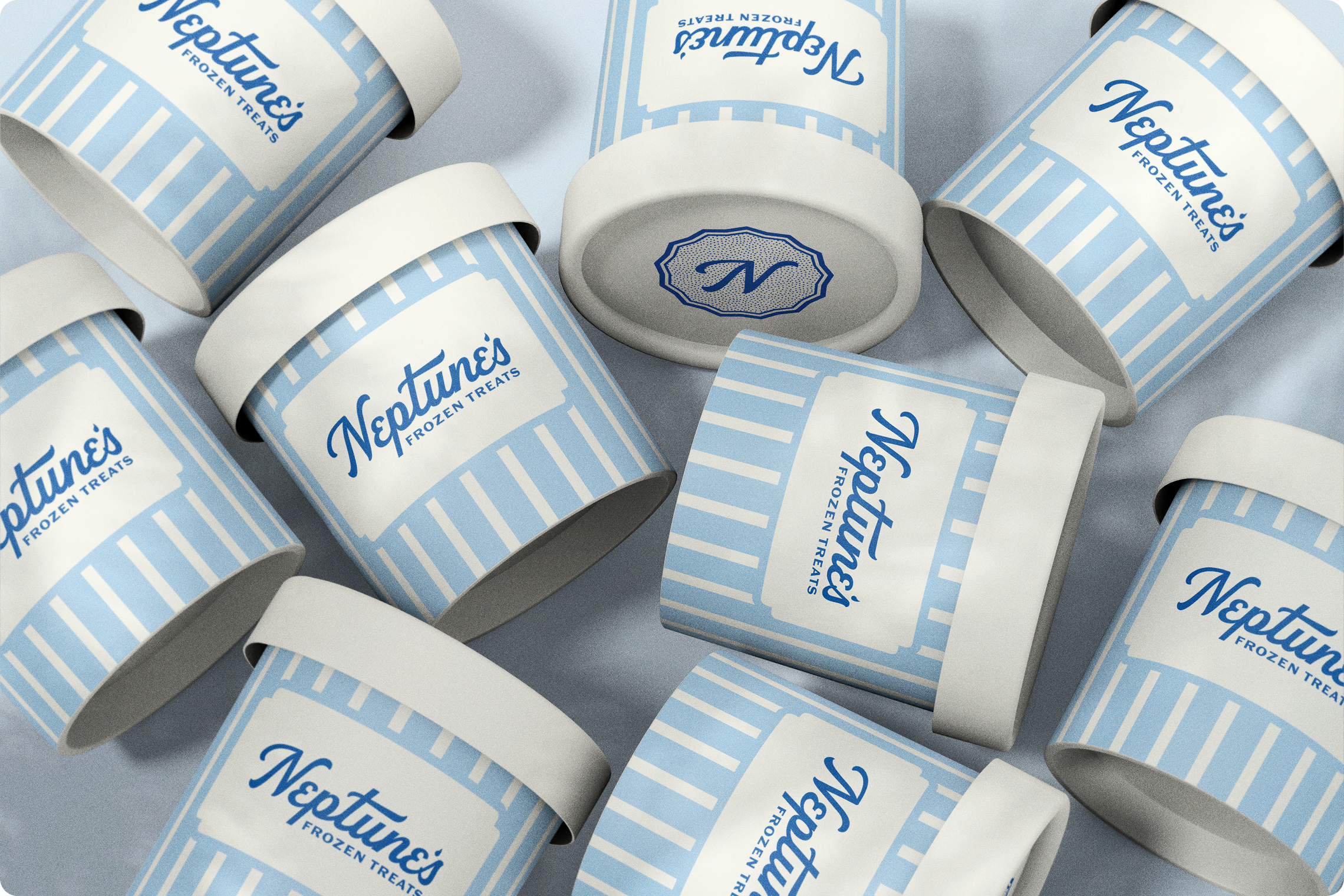
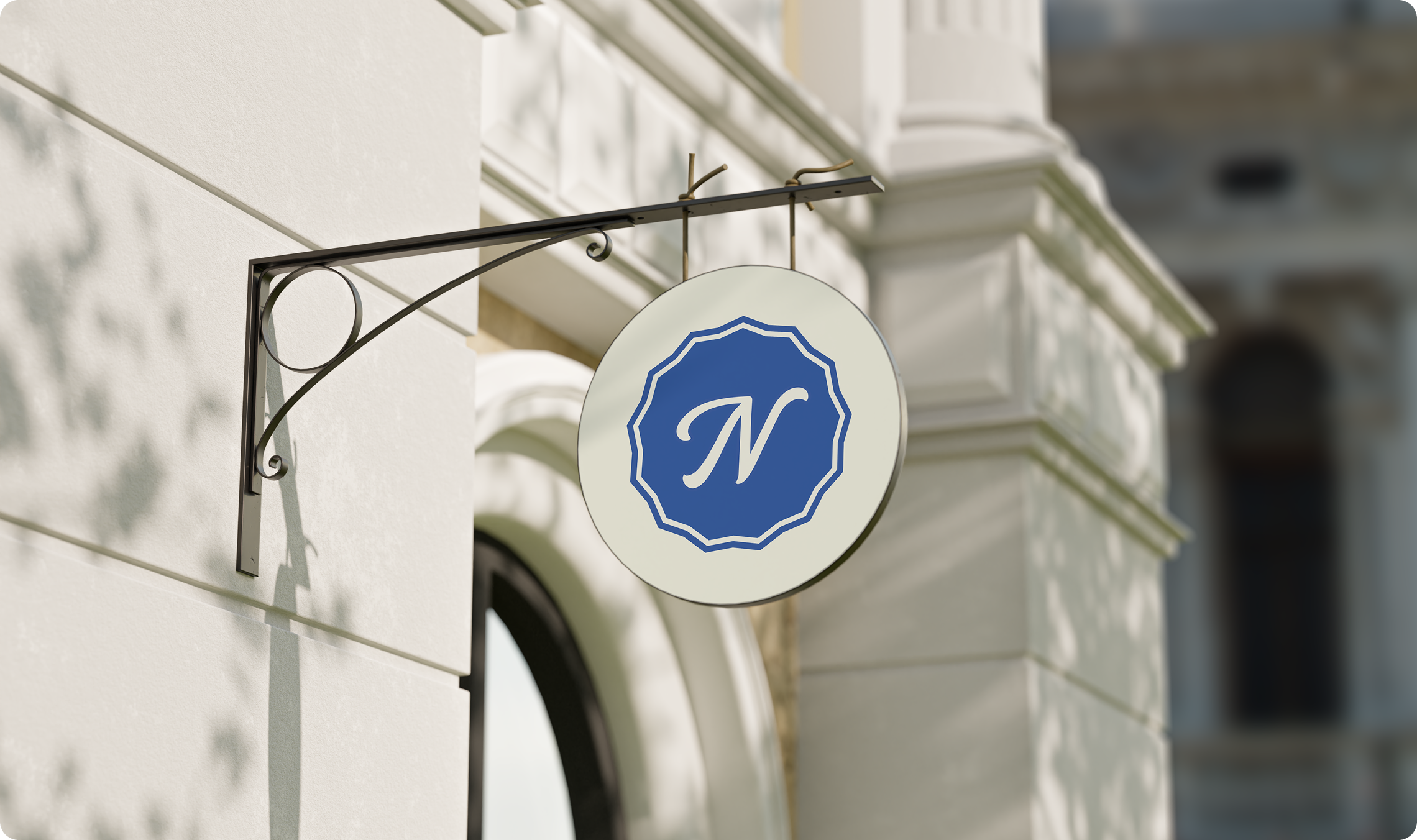
Neptune’s visual branding was built to break away from the expected. Rather than follow the pastel, gimmick-heavy style common in dessert shops, we crafted a visual identity that feels clean and modern without losing its mythical roots. Inspired by the Mediterranean and the California coast, the brand’s deep blues and sunlit accent colors evoke ocean depth and warmth, while custom typography and a wave-kissed logo reflect Neptune’s playful yet elevated persona. Every element — from the drop detail in the logo to the supporting tile-inspired patterns — was chosen to feel timeless, local, and unmistakably premium.
The photography guidelines were just as intentional. Product imagery highlights texture and freshness with soft, natural light and minimalist styling, ensuring the frozen treats always take center stage. Lifestyle photography captures sun-soaked, joyful moments that reflect the brand’s coastal setting and community-first values.
Sea, Touch, Taste, Wear
To extend Neptune’s brand from concept to customer experience, Tegan designed a tactile, inviting, and memorable lineup of collateral. From the moment someone walks in, every visual element reinforces Neptune’s identity.
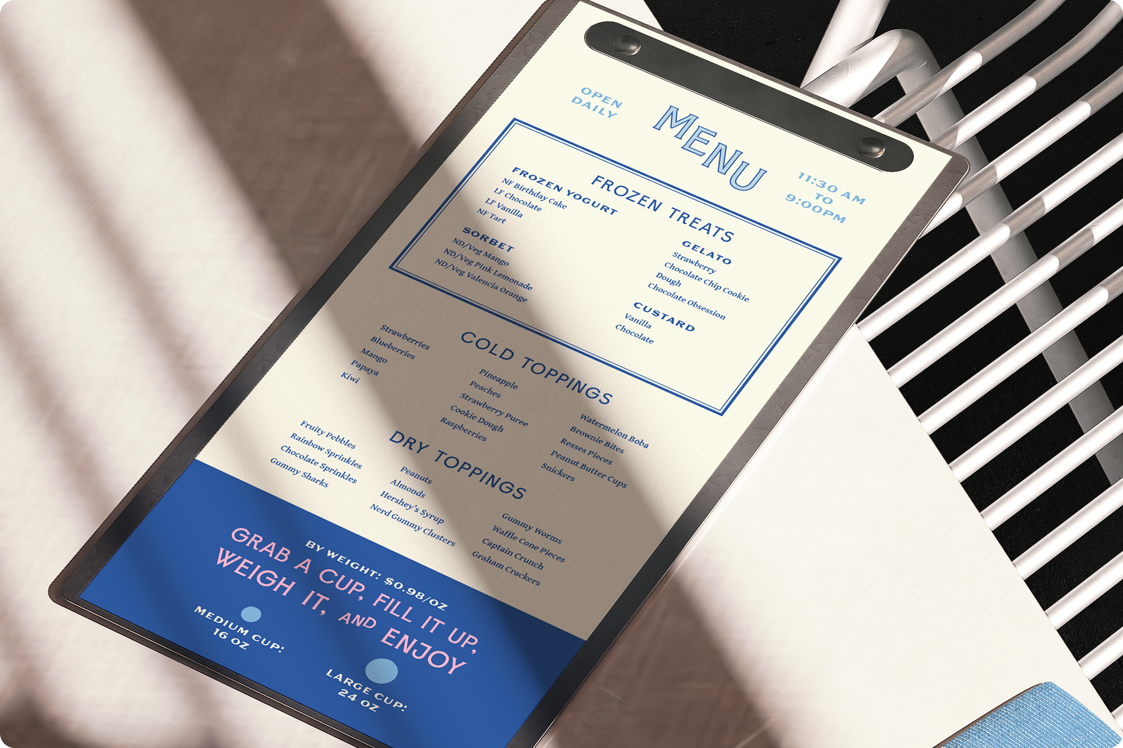
Cups, napkins, coasters, menus, decals, and signage all share a unified design language: bold stripes inspired by Mediterranean architecture, crisp typography with mythic flair, and a consistent palette rooted in sea and sun. The mosaic tile hero wall installation at the entrance adds a literal sense of place — part myth, part monument — welcoming guests into Neptune’s world. The menu system keeps things streamlined and clear, while branded language turns even functional items into moments of engagement. And don’t forget the sea-worthy swag! Hats, shirts, stickers, and even employee uniforms were designed to boost brand love and give customers a little bit of Neptune’s to take with them.
More of our work
All case studies
Coca-Cola Southwest Beverages
Dallas-based Coca-Cola Southwest Beverages (CCSWB) is one of the largest Coca-Cola bottlers in the United States, serving happiness to over 31 million folks across the country.
People Serving People
People Serving People is Minnesota’s largest emergency shelter for families experiencing homelessness and a leader in prevention services.